library(tidyverse)
library(lubridate)Working with Tidy Survival Data
02 / From familiar R objects to a tidy workflow
Preparing survival data requires selecting the appropriate records, defining event indicators, and labeling variables. These operations connect the scientific question to the analysis. Base R provides the necessary functions, although their syntax varies across tasks.
The tidyverse provides a consistent vocabulary for data manipulation. A sequence of operations can select columns, create variables, and filter records in the order required by the analysis. This organization makes the code easier to inspect and revise while preserving the underlying statistical methods.
Small datasets make the effects of individual operations visible. The examples begin with six records before introducing date conversion, reshaping, and preparation of the German breast cancer data. No previous tidyverse experience is assumed.
The same workflow supports the production of figures and tables. Graphics and table functions provide explicit control over labels, layout, and summaries, allowing presentation choices to be recorded in code and reapplied when the data change.
2.1 Start with a small table
2.1.1 Packages, functions, and objects
A package is a collection of functions and related resources. Installing a package makes it available on your computer; loading it makes its functions available in the current session. Installation is usually done once, while library() is used again when a new session begins. The setup page gives the installation commands.
tidyverse loads a coordinated set of packages. We will use dplyr for data manipulation, tidyr for reshaping, ggplot2 for graphics, readr for parsing numbers, and stringr for working with text. lubridate provides readable date-handling functions; loading it explicitly makes that dependency clear.
We start with a tibble, a modern form of R data frame. It still has rows and columns, but its printed display emphasizes the dimensions and column types.
trial <- tibble(
  id = 1:6,
  trt = c("A", "A", "B", "B", "A", "B"),
  age = c(65, 70, 58, 60, 64, 59),
  time = c(5, 8, 12, 3, 2, 6),
  status = c(1, 0, 1, 1, 0, 0)
)
trial
# A tibble: 6 × 5
id trt age time status
<int> <chr> <dbl> <dbl> <dbl>
1 1 A 65 5 1
2 2 A 70 8 0
3 3 B 58 12 1
4 4 B 60 3 1
5 5 A 64 2 0
6 6 B 59 6 0There are six people, each represented once. id identifies a person, trt records a group, and time and status describe follow-up in months. As before, status 1 means an event and status 0 means censoring. The notation <chr> under trt means character data; <dbl> and <int> indicate numerical types. Those labels describe storage, not the scientific role of a variable. A numerical code can still represent categories.
The assignment arrow <- stores the table under the name trial. Typing that name displays it. Creating another table from it will not change trial unless we explicitly assign the result back to that name.
2.1.2 What makes data tidy?
Tidy data have one variable per column, one observation per row, and separate tables when different types of observational units need representation. The crucial word is observation. For the simple right-censored analysis here, a row is a person. For repeated visits, a row might be a person-visit. For event histories, it may be a person-event record.
Thus, “one row per person” is appropriate for our current analysis but is not a universal definition of tidiness. The 985 rows in the GBC event-history file are not automatically a mistake. The mistake would be treating them as 985 independent patients in an analysis that requires one record per patient.
Before transforming a dataset, identify what each row represents and ensure that this unit is appropriate for the intended analysis. For a simple first-event analysis, each row should represent one participant; event-history data may contain several records per participant.
2.2 Data verbs and pipelines
2.2.1 Choose columns with select()
Suppose we want a compact view of treatment and outcome. select() chooses columns by name:
select(trial, id, trt, time, status)# A tibble: 6 × 4
id trt time status
<int> <chr> <dbl> <dbl>
1 1 A 5 1
2 2 A 8 0
3 3 B 12 1
4 4 B 3 1
5 5 A 2 0
6 6 B 6 0The first argument is the input data. The remaining arguments identify columns to retain, in the order we want to see them. We do not need quotation marks around these column names inside select(). That is part of the package’s data-oriented syntax.
This result still has six rows. Selecting columns changes which variables we see, not which people we include. It also leaves the original trial object intact.
2.2.2 Create columns with mutate()
Now add a descriptive age group. This is a small illustration of making a new column, not a recommendation to categorize continuous age for regression.
trial_with_age <- mutate(
  trial,
  age_group = if_else(age >= 65, "65 or older", "Under 65")
)
trial_with_age
# A tibble: 6 × 6
id trt age time status age_group
<int> <chr> <dbl> <dbl> <dbl> <chr>
1 1 A 65 5 1 65 or older
2 2 A 70 8 0 65 or older
3 3 B 58 12 1 Under 65
4 4 B 60 3 1 Under 65
5 5 A 64 2 0 Under 65
6 6 B 59 6 0 Under 65 mutate() creates the column named age_group. Within it, if_else() takes three arguments in order:
age >= 65: the condition to check for each person."65 or older": the value to use when the condition is true."Under 65": the value to use when the condition is false.
A person aged exactly 65 belongs to the first group because we used >=. The original age remains available alongside the new variable.
The number of rows has not changed. This distinction helps when checking a pipeline: adding a variable should not silently drop participants.
2.2.3 Choose rows with filter() and order them with arrange()
To keep treatment A, write a logical condition. The double equals sign == tests equality; it is different from using = to name a function argument.
arm_a <- filter(trial_with_age, trt == "A")
arrange(arm_a, time)
# A tibble: 3 × 6
id trt age time status age_group
<int> <chr> <dbl> <dbl> <dbl> <chr>
1 5 A 64 2 0 Under 65
2 1 A 65 5 1 65 or older
3 2 A 70 8 0 65 or olderThe result contains people 5, 1, and 2, ordered from shortest to longest observed time. filter() changed the number of rows, while arrange() changed their order. Neither operation converted a censored time into an event time.
A filter retains rows for which the condition is TRUE. A missing condition is not true and is therefore dropped. If a selection variable contains missing values, decide whether they should be retained before writing the filter; otherwise the resulting sample can be smaller than intended.
2.2.4 Connect the steps with a pipe
The native R pipe, |>, passes the result on its left to the next function, usually as its first argument. The following reproduces the preceding preparation as one sequence:
arm_a_ordered <- trial |>
  mutate(age_group = if_else(age >= 65, "65 or older", "Under 65")) |>
  filter(trt == "A") |>
  arrange(time)
arm_a_ordered
# A tibble: 3 × 6
id trt age time status age_group
<int> <chr> <dbl> <dbl> <dbl> <chr>
1 5 A 64 2 0 Under 65
2 1 A 65 5 1 65 or older
3 2 A 70 8 0 65 or olderBegin with trial, add a column, keep treatment A, and order the remaining records. Each line describes an operation, and the output of one becomes the input of the next. The arrow at the beginning saves the final result as arm_a_ordered. Without that assignment, R would display the result but would not create this new named object.
The pipe is useful because it makes the sequence easy to read. It does not automatically make every order of operations equivalent. Filtering before a summary changes the population being summarized. Sorting before selecting a first record determines which record survives.
2.2.5 Summarize within groups
mutate() adds information while keeping individual rows. summarise() reduces rows to group-level quantities. To summarize by treatment, first tell R how to group the table.
trial |>
  group_by(trt) |>
  summarise(
    patients = n(),
    observed_events = sum(status == 1),
    median_observed_time = median(time),
    .groups = "drop"
  )
# A tibble: 2 × 4
trt patients observed_events median_observed_time
<chr> <int> <int> <dbl>
1 A 3 1 5
2 B 3 2 6Each treatment arm contains three people. Arm A has one observed event and arm B has two. The median observed times are 5 and 6 months. n() counts rows within each group, and sum(status == 1) counts the true comparisons. .groups = "drop" returns an ungrouped result so that a later operation will not unexpectedly continue working within these groups.
The name median_observed_time is deliberate. This is the median of the recorded event-or-censoring times. It is not a Kaplan–Meier median survival time. Similarly, one event among three participants is a description of observed records, not an estimate of the probability of an event by a common time under unequal follow-up.
Our small example has no missing values. In other data, sum() and median() can return NA. Adding na.rm = TRUE may be appropriate, but it changes the calculation to the nonmissing observations. Count and explain those missing records rather than hiding the issue in an argument.
Exercise: summarize the other arm
Select treatment B and report the number of patients and observed events. Predict the answer before running the code.
trial |>
  filter(trt == "B") |>
  summarise(patients = n(), observed_events = sum(status == 1))
# A tibble: 1 × 2
patients observed_events
<int> <int>
1 3 2The answer is three people and two observed events. A filter changed the population first; the summary then described only that population.
2.3 Prepare survival data
2.3.1 Turn dates into follow-up times
A spreadsheet may contain dates rather than elapsed times. We must choose a time origin, an endpoint date, and an endpoint type. The resulting duration depends on a consistent definition of the origin and endpoint.
Suppose start_date records entry and end_date records death or last known follow-up. The strings below look like dates to us, but initially R stores them as text.
dates_raw <- tibble(
  id = 1:3,
  start_date = c("2022-01-01", "2022-01-15", "2022-01-20"),
  end_date = c("2022-04-01", "2022-06-01", "2022-03-15"),
  outcome = c("dead", "censored", "dead")
)
dates_raw
# A tibble: 3 × 4
id start_date end_date outcome
<int> <chr> <chr> <chr>
1 1 2022-01-01 2022-04-01 dead
2 2 2022-01-15 2022-06-01 censored
3 3 2022-01-20 2022-03-15 dead ymd() reads a year-month-day ordering and creates date objects that can be subtracted. Inside mutate(), a column created earlier can be used by a later expression in the same call.
dates_ready <- dates_raw |>
  mutate(
    start_date = ymd(start_date),
    end_date = ymd(end_date),
    time_days = as.numeric(end_date - start_date),
    event = case_when(
      outcome == "dead" ~ 1L,
      outcome == "censored" ~ 0L,
      TRUE ~ NA_integer_
    )
  )
dates_ready
# A tibble: 3 × 6
id start_date end_date outcome time_days event
<int> <date> <date> <chr> <dbl> <int>
1 1 2022-01-01 2022-04-01 dead 90 1
2 2 2022-01-15 2022-06-01 censored 137 0
3 3 2022-01-20 2022-03-15 dead 54 1The first follow-up lasts 90 days, the second 137, and the third 54. as.numeric() turns the date difference into a numerical day count. We name the column time_days to carry the unit with the result. These are not months, and relabeling the axis as months would not convert them.
case_when() reads its conditions in order and uses the value after ~ for the first match. Here that symbol pairs a condition with a result; it is not a model formula. 1L and 0L are integer values. The last line leaves an unrecognized outcome missing rather than declaring it censored. Missing endpoint information and known censoring are different states of knowledge.
The conversion should be followed by a check for missing values and impossible ordering:
dates_ready |>
  summarise(
    missing_time = sum(is.na(time_days)),
    missing_event = sum(is.na(event)),
    negative_time = sum(time_days < 0, na.rm = TRUE)
  )
# A tibble: 1 × 3
missing_time missing_event negative_time
<int> <int> <int>
1 0 0 0All three counts are zero for this example. A negative value would send us back to the dates and origin definition. A parsing failure would prompt us to inspect the original string and its format. For instance, a date written month-day-year calls for mdy(), not ymd(). Do not choose a format merely because it produces a nonmissing answer when the source is ambiguous.
2.3.2 Separate time from a censoring symbol
Printed records sometimes combine time and censoring, as in 32+. Once the source convention is known, separate that record into two columns.
recorded <- tibble(record = c("10", "32+", "23", "25+"))
parsed <- recorded |>
  mutate(
    time = parse_number(record),
    event = if_else(str_detect(record, fixed("+")), 0L, 1L)
  )
parsed
# A tibble: 4 × 3
record time event
<chr> <dbl> <int>
1 10 10 1
2 32+ 32 0
3 23 23 1
4 25+ 25 0parse_number() extracts the numerical part. str_detect() asks whether the text contains a pattern; fixed("+") means the literal plus character. We therefore get a time of 32 with event 0, and a time of 23 with event 1. The original text is retained so that the conversion can be checked.
This code is for the stated convention and these valid strings. A blank, a different symbol, or an unknown time requires its own rule. A general parser should not guess that every unfamiliar record without a plus sign is an observed event.
2.3.3 Reshape without losing the meaning of a row
Some files keep several kinds of follow-up in different columns. In this small example, each person has information about progression and death. The table is wide: endpoint-specific quantities sit side by side.
wide <- tibble(
  id = 1:3,
  prog_time = c(10, 20, 30),
  prog_status = c(1, 0, 1),
  death_time = c(15, 20, 35),
  death_status = c(0, 1, 1)
)
wide
# A tibble: 3 × 5
id prog_time prog_status death_time death_status
<int> <dbl> <dbl> <dbl> <dbl>
1 1 10 1 15 0
2 2 20 0 20 1
3 3 30 1 35 1Person 1 has progression at time 10 and is last known alive at time 15. Person 2 has no observed progression before death at time 20. Person 3 progresses at time 30 and dies at time 35. The paired column names help us see which status belongs with which time.
pivot_longer() can turn those pairs into a table with one row per person and endpoint:
long <- wide |>
  pivot_longer(
    cols = -id,
    names_to = c("endpoint", ".value"),
    names_sep = "_"
  )
long
# A tibble: 6 × 4
id endpoint time status
<int> <chr> <dbl> <dbl>
1 1 prog 10 1
2 1 death 15 0
3 2 prog 20 0
4 2 death 20 1
5 3 prog 30 1
6 3 death 35 1Work through the arguments using prog_time as an example:
cols = -idselects all columns except the identifier for reshaping. The identifier is retained to keep the records connected to people.names_sep = "_"splits each selected name at the underscore:prog_timebecomes the piecesprogandtime.names_to = c("endpoint", ".value")specifies where those pieces go. The first becomes a value in the newendpointcolumn. The special name.valuemeans that the second becomes an output column name, heretime.
The same rule puts the value from prog_status into the status column on that progression row. Thus the time and status remain paired while the endpoint name moves out of the column heading and into the data.
There are now six rows because each of three people has two endpoint records. No new patients have been created. We have changed the representation while retaining the information, including the censored endpoint records.
This table is useful for inspection and endpoint-specific summaries. It is not yet a start-stop dataset, and its rows should not all be passed to a simple independent-person survival analysis. In particular, a death that prevents a future progression may require a competing-risk formulation, rather than treating that death as ordinary uninformative censoring for progression. Reshaping makes the columns consistent; it does not decide the scientific estimand.
Exercise: count people and records
How many rows and distinct people are in long? Then count observed events separately for each endpoint.
long |>
  summarise(records = n(), people = n_distinct(id))
# A tibble: 1 × 2
records people
<int> <int>
1 6 3long |>
group_by(endpoint) |>
summarise(observed_events = sum(status == 1), .groups = "drop")# A tibble: 2 × 2
endpoint observed_events
<chr> <int>
1 death 2
2 prog 2There are six records but three people, with two observed events of each endpoint type. The event counts describe recorded outcomes; they do not account for censoring when estimating probabilities over time.
2.3.4 Return to the breast cancer data
The first-event preparation in Chapter 1 can also be expressed with tidy data operations. Reading the data explicitly allows the code to run in a fresh R session without relying on previously created objects.
gbc_raw <- as_tibble(read.table("data/gbc.txt", header = TRUE))
gbc_raw |>
  select(id, time, status, hormone) |>
  slice_head(n = 6)
# A tibble: 6 × 4
id time status hormone
<int> <dbl> <int> <int>
1 1 43.8 1 1
2 1 74.8 0 1
3 2 46.6 1 1
4 2 65.8 0 1
5 3 41.9 1 1
6 3 47.7 2 1We use read.table() for the supplied text file, which includes quoted row names, and then convert its data frame to a tibble with as_tibble(). Tidyverse functions can work alongside familiar base R functions. Adopting a tidy workflow does not require changing every function at once.
We want one row per patient for first relapse or death. Sorting establishes which row should come first; grouping makes the first-row operation apply separately to each patient.
rfs <- gbc_raw |>
  arrange(id, time, status == 0) |>
  group_by(id) |>
  slice_head(n = 1) |>
  ungroup() |>
  mutate(
    event = as.integer(status > 0),
    hormone = factor(hormone, levels = c(1, 2), labels = c("No", "Yes")),
    meno = factor(meno, levels = c(1, 2), labels = c("Pre", "Post")),
    grade = factor(grade, levels = c(1, 2, 3), labels = c("I", "II", "III"))
  )
This is the same logic as the base R preparation, written as a sequence. At a tied recorded time, status == 0 sorts event records before censoring records. slice_head(n = 1) then retains one record in each patient group. ungroup() removes the grouping because subsequent operations should treat the result as a whole table. The final step creates the binary event indicator and labels the categorical variables.
If patient-level grouping remains in place, a subsequent summarise() returns one summary per patient. Use ungroup() when subsequent operations should apply to the full dataset.
rfs |>
  summarise(
    rows = n(),
    patients = n_distinct(id),
    events = sum(event),
    missing_time = sum(is.na(time)),
    missing_event = sum(is.na(event))
  )
# A tibble: 1 × 5
rows patients events missing_time missing_event
<int> <int> <int> <int> <int>
1 686 686 299 0 0We recover 686 rows, 686 people, and 299 first events, with no missing times or event indicators. These counts match Chapter 1. The statistical outcome has stayed the same while the preparation has acquired a different syntax.
For a quick descriptive check by treatment, use:
rfs |>
  group_by(hormone) |>
  summarise(patients = n(), observed_events = sum(event), .groups = "drop")
# A tibble: 2 × 3
hormone patients observed_events
<fct> <int> <int>
1 No 440 205
2 Yes 246 94The no-hormone group contains 440 patients and 205 observed first events; the hormone group contains 246 patients and 94 events. These totals help verify the preparation. They do not replace the survival curves, because they do not place everyone at a common duration of follow-up.
2.4 Build a follow-up plot in layers
A swimmer plot displays individual observation periods. It is useful before modeling because an unusual duration or endpoint can be easier to spot in a picture than in a long table. It also reconnects the prepared dataset to the incomplete observations described in Chapter 1.
We use the small rat example from the course. The outcome is tumor development, follow-up is in days, and each row is one animal. Adding explicit identifiers lets us refer back to particular records.
rats <- tibble(
  id = 1:11,
  time = c(101, 55, 67, 23, 45, 98, 34, 77, 91, 104, 88),
  status = c(0, 0, 1, 0, 1, 0, 1, 0, 0, 0, 1),
  group = c("A", "A", "A", "B", "B", "B", "A", "B", "B", "A", "B")
) |>
  mutate(
    outcome = factor(status, levels = c(0, 1),
                     labels = c("Censored", "Tumor development")),
    subject = reorder(factor(id), time)
  )
The factor outcome supplies readable legend labels. subject is a categorical identifier ordered by follow-up length. Ordering it for display does not change any event time; it simply helps us compare short and long observation periods.
A ggplot2 plot begins with data and aesthetic mappings. A mapping connects a column to a visual property such as horizontal position, vertical position, color, or shape. Here time determines horizontal position and subject determines vertical position; a line segment and endpoint represent each animal’s follow-up.
swimmer <- ggplot(rats, aes(x = time, y = subject)) +
  geom_segment(aes(x = 0, xend = time, yend = subject),
               colour = "#172d49", linewidth = 0.6) +
  geom_point(aes(shape = outcome), size = 3, colour = "#172d49")
swimmer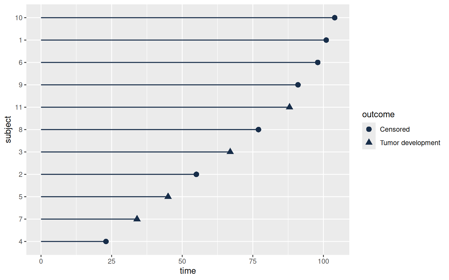
ggplot() creates the plot specification. geom_segment() adds a line from time zero to the observed time on each row. geom_point() adds the endpoint and uses the outcome to choose its shape. The + signs add layers to the plot; unlike |>, they do not pass a data table from one manipulation verb to another.
The placement of an argument matters. shape = outcome is inside aes() because its value changes with a column. The fixed line color is outside aes() because every line gets the same color. Putting a literal color name inside aes() would request a mapping rather than directly setting the color.
The first version is useful, but its labels and default symbols can be improved without rewriting the data preparation or the layers.
swimmer <- swimmer +
  scale_shape_manual(values = c("Censored" = 1, "Tumor development" = 16)) +
  scale_x_continuous(expand = expansion(mult = c(0, 0.05))) +
  labs(x = "Days of follow-up", y = "Rat", shape = NULL) +
  theme_minimal(base_size = 12) +
  theme(legend.position = "top", panel.grid.major.y = element_blank())
swimmer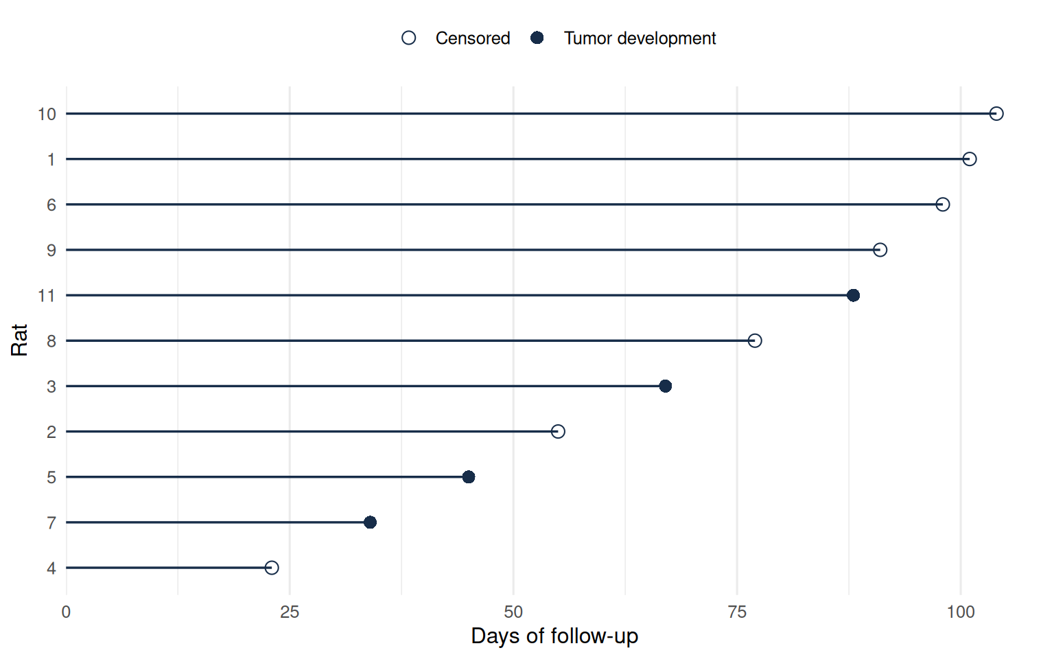
The shape scale explicitly chooses an open circle for censoring and a filled circle for tumor development. labs() sets the axis text and removes an unnecessary legend title. The theme changes presentation without changing the data or estimates. Saving the result back to swimmer retains these additions.
Read the finished picture one row at a time. A line ending with an open circle at day 101 says that the rat was observed without the event until that time. It does not say the rat would remain event-free indefinitely. This is an individual-follow-up display, not a Kaplan–Meier estimate: the lengths are observed times, and the plot does not adjust event probabilities for censoring.
Exercise: separate the experimental groups
Show the same plot in one panel per group, letting each panel display only its own subject labels.
swimmer + facet_wrap(~ group, scales = "free_y")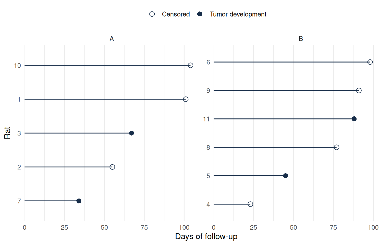
Faceting separates the observations visually. It does not fit a separate survival curve or carry out a treatment comparison. The shared horizontal scale still permits a direct comparison of follow-up durations.
2.4.1 Save a figure with explicit dimensions
A saved plot should have predictable dimensions independent of the size of the RStudio plot pane. Supply the plot object explicitly to ggsave() so that an unrelated plot displayed later does not become the exported figure.
dir.create("outputs", showWarnings = FALSE)
ggsave("outputs/follow-up.png", plot = swimmer,
       width = 7, height = 4.5, units = "in", dpi = 300,
       bg = "white")
plot = swimmerselects the saved plot object.width,height, andunitsspecify its physical dimensions.dpisets the resolution for this PNG file. Increasing resolution does not enlarge labels relative to the figure.- The filename extension selects the output format. A
.pdffile is useful for vector graphics; a.pngfile is convenient for slides and documents.
This export example runs when you execute it yourself; rendering the chapter does not create personal output files. Examine the figure at its intended size before using it in a report. The official export reference describes further device and sizing options.
2.5 Make a descriptive Table 1
2.5.1 Begin with the right denominator
A baseline descriptive table usually summarizes people. If we construct it directly from the GBC event-history rows, a person with both relapse and later mortality follow-up can contribute twice. The resulting percentages would then describe records rather than patients.
Use the mortality file, which contains one row per patient and the baseline variables. We will summarize baseline characteristics, keeping the outcome summaries separate.
patients <- as_tibble(read.table("data/gbc_mort.txt", header = TRUE)) |>
  mutate(
    hormone = factor(hormone, levels = c(1, 2), labels = c("No", "Yes")),
    meno = factor(meno, levels = c(1, 2), labels = c("Pre", "Post")),
    grade = factor(grade, levels = c(1, 2, 3), labels = c("I", "II", "III"))
  )
patients |>
  summarise(rows = n(), patients = n_distinct(id))
# A tibble: 1 × 2
rows patients
<int> <int>
1 686 686Both counts are 686. Matching them is a useful check on our intended unit of analysis. We keep id for checking and linking records but will not summarize it as a patient characteristic.
2.5.2 Turn the selected columns into a table
gtsummary works with a data frame or tibble and returns a table object. It is installed separately from the core tidyverse. We begin with a small set of baseline variables so that the table can be read comfortably.
library(gtsummary)
table1 <- patients |>
  select(hormone, age, meno, grade, size, nodes) |>
  tbl_summary(
    by = hormone,
    type = list(c(age, size, nodes) ~ "continuous"),
    statistic = list(
      all_continuous() ~ "{median} ({p25}, {p75})",
      all_categorical() ~ "{n} ({p}%)"
    ),
    label = list(
      age ~ "Age (years)",
      meno ~ "Menopausal status",
      grade ~ "Tumor grade",
      size ~ "Tumor size (mm)",
      nodes ~ "Positive lymph nodes"
    ),
    missing = "ifany"
  )
table1| Characteristic | No N = 4401 |
Yes N = 2461 |
|---|---|---|
| Age (years) | 50 (45, 59) | 58 (50, 63) |
| Menopausal status | ||
| Pre | 231 (53%) | 59 (24%) |
| Post | 209 (48%) | 187 (76%) |
| Tumor grade | ||
| I | 48 (11%) | 33 (13%) |
| II | 281 (64%) | 163 (66%) |
| III | 111 (25%) | 50 (20%) |
| Tumor size (mm) | 25 (20, 35) | 25 (20, 35) |
| Positive lymph nodes | 3 (1, 7) | 3 (1, 7) |
| 1 Median (Q1, Q3); n (%) | ||
The pipe passes the selected data into tbl_summary(). Its main options each answer a different reporting question:
by = hormone: which groups should have separate columns?type: which variables should receive continuous summaries? Here we explicitly select age, size, and node count, while the factor variables receive categorical summaries.statistic: what quantities should appear in the cells? We request medians and quartiles for continuous variables, and counts and percentages for categories.label: what readable names should replace the variable names in the display?missing = "ifany": should a missing-value row appear? This setting includes one whenever a variable has missing observations.
Specifying the variable types prevents storage codes or the number of distinct numerical values from making the summary choice for us. Most importantly, these choices are recorded in the code, so the table can be regenerated after the data change.
The statistic argument specifies what each cell should display. {median}, {p25}, and {p75} stand for the computed median and quartiles. For a category, {n} is its count and {p} its percentage within the treatment column. The expressions with ~ associate variable selections with display instructions.
Read the group sizes first: they should match the 440 and 246 patients counted earlier. Then interpret a continuous entry as a median followed by the 25th and 75th percentiles, not a confidence interval. For a categorical row, read the count together with its percentage within that group. Unequal group sizes make that percentage more informative than comparing counts alone.
For example, the no-hormone column reports age as 50 (45, 59): half of those patients are at or below about 50 years, and the middle half lie between the reported quartiles of 45 and 59. The hormone group’s median age is 58 years. Likewise, 231 of 440 patients in the no-hormone group are premenopausal (about 53%), compared with 59 of 246 in the hormone group (about 24%). These entries describe differences in the groups’ composition and give context for the adjusted analysis in Chapter 1.
missing = "ifany" asks for a missing-value row when needed. These selected variables are complete in the supplied data, so no such row appears. In data with missing characteristics, check both the missing count and the nonmissing denominator behind the reported percentages.
2.5.3 Add an overall column
Because the result is an object, we can extend it after checking the basic table.
Add the overall column
table1 |>
  add_overall() |>
bold_labels()| Characteristic | Overall N = 6861 |
No N = 4401 |
Yes N = 2461 |
|---|---|---|---|
| Age (years) | 53 (46, 61) | 50 (45, 59) | 58 (50, 63) |
| Menopausal status | |||
| Pre | 290 (42%) | 231 (53%) | 59 (24%) |
| Post | 396 (58%) | 209 (48%) | 187 (76%) |
| Tumor grade | |||
| I | 81 (12%) | 48 (11%) | 33 (13%) |
| II | 444 (65%) | 281 (64%) | 163 (66%) |
| III | 161 (23%) | 111 (25%) | 50 (20%) |
| Tumor size (mm) | 25 (20, 35) | 25 (20, 35) | 25 (20, 35) |
| Positive lymph nodes | 3 (1, 7) | 3 (1, 7) | 3 (1, 7) |
| 1 Median (Q1, Q3); n (%) | |||
The overall column combines the study participants, while the treatment columns remain available for comparison. Bold labels help separate variables from their categories. These are presentation choices; they do not change which patients enter the table.
A Table 1 describes the analysis population and its covariate distributions. Whether to include hypothesis tests depends on the study design and purpose; nonsignificant baseline tests do not establish that groups are equivalent. Descriptive summaries also need to be distinguished from survival estimates, which account for follow-up time and censoring.
2.5.4 Refine headings and retain an exportable table
A table should identify both its population and its grouping variable. The formatting functions in gtsummary can be applied to the existing table object without repeating the calculation of its summaries.
Customize the table headings
table1_report <- table1 |>
  modify_header(label = "**Baseline characteristic**") |>
  modify_spanning_header(all_stat_cols() ~ "**Hormone therapy**") |>
  modify_caption("**Baseline characteristics of the 686 GBC patients**") |>
  bold_labels()
table1_report| Baseline characteristic |
Hormone therapy
|
|
|---|---|---|
| No N = 4401 |
Yes N = 2461 |
|
| Age (years) | 50 (45, 59) | 58 (50, 63) |
| Menopausal status | ||
| Pre | 231 (53%) | 59 (24%) |
| Post | 209 (48%) | 187 (76%) |
| Tumor grade | ||
| I | 48 (11%) | 33 (13%) |
| II | 281 (64%) | 163 (66%) |
| III | 111 (25%) | 50 (20%) |
| Tumor size (mm) | 25 (20, 35) | 25 (20, 35) |
| Positive lymph nodes | 3 (1, 7) | 3 (1, 7) |
| 1 Median (Q1, Q3); n (%) | ||
modify_header() changes a column heading. Here label is the table’s characteristic-label column, not a variable in the patient dataset. modify_spanning_header() places a shared heading above the treatment columns selected by all_stat_cols(). modify_caption() identifies the population summarized. The header reference and summary-table tutorial describe these customization tools.
For an HTML file that can be shared independently, convert the result to a gt table and save it:
dir.create("outputs", showWarnings = FALSE)
table1_report |>
  as_gt() |>
  gt::gtsave(filename = "outputs/baseline-table.html")
The conversion function changes the table object to the format used by gt; it does not refit a model or change the observations summarized. gtsave() selects the export format from the filename. Keep the R code and table object as the editable source, and regenerate the file after revisions to the analysis.
2.6 From prepared data to tidy survival analysis
select() chooses variables, mutate() creates or transforms them, filter() selects observations, and arrange() sets their order. Grouping applies operations within defined units; summarizing reduces the data to quantities about those units. Reshaping reorganizes measurements, while graphics and tables display the resulting records and summaries.
These operations must preserve the meaning of the observations. Event indicators distinguish events from censoring, elapsed times retain explicit units, and the number of rows per participant reflects the analysis being performed. A change in data layout should not inadvertently change the outcome definition or the analysis population.
The data preparation, plotting, and table-building skills developed here support more specialized reporting. Chapter 3 applies them to survival curves and competing-risk cumulative incidence. Chapter 4 covers regression results, including Cox-model tables and competing-risk regression.
The chapter script contains these examples in order. You can run it in a fresh session from the project folder; it reads the supplied data itself rather than relying on Chapter 1’s workspace.
Documentation for further study
The package authors provide introductions to dplyr’s data verbs and references for pivot_longer(), date parsing, plotting line segments, and tbl_summary(). These references describe additional arguments and options for each function.